
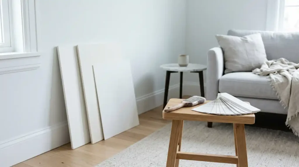
If you searched “decorator white,” you probably mean Benjamin Moore’s Decorator’s White. It’s a popular cool white, and a tricky one. On a paper chip it looks clean and neutral. On your wall it can lean gray, blue, or even purple, depending on light and neighbors. Reviewers also disagree on its numbers, which confuses people. Below you’ll see three myths to drop, what the color actually looks like, where it works, and how to test it. I checked Benjamin Moore’s own page and several designer reviews and note where they differ. Always sample it in your own room before you buy a gallon.
Three Myths About Decorator White
White paint hides surprises. This one has a few common misconceptions attached.
Clear them up first, and you’ll avoid the most expensive mistakes.
Is it a pure white?
No. It’s a white with a cool, gray lean. Heathered Nest says it has the faintest hint of gray and blue without giving off any obvious undertone color. Other reviewers see more. That gap between opinions is the whole point: you need to see it yourself. heatherednest
Are OC-149 and CC-20 different colors?
They’re the same shade with two codes. Benjamin Moore’s French site lists it as CC-20 in the Designer Classics Collection. Reviewers confirm it’s also in the Off-White Collection as OC-149, and some add PM-3 as another code. Benjamin Moore | Decorator’s White +2
Is it a warm white?
Not at all. It’s cool. Hello Lovely Studio puts it plainly: compared with White Dove, CC-20 is much cooler. If you want warmth, look elsewhere. hellolovelystudio
What Decorator White Actually Looks Like
Three things shape how it reads: its brightness, its undertones, and your light. Numbers help, but they don’t settle the argument.
Start with brightness.
What is its LRV?
Benjamin Moore lists an LRV of 84.61. Reviewers don’t all agree. One cites 82.68, and another says 83. The spread is small, and I’d trust the manufacturer’s number most. For comparison, Super White sits at 89.09, while White Dove is a touch higher at 85.38. So it’s bright, but not stark. Benjamin Moore | Decorator’s White +4
What undertones does it have?
Mostly gray, with hints of purple and blue. Julie Blanner lists gray, purple, and blue undertones. Kylie M Interiors goes further, saying it can pick up blue, green, or purple, and favors purple. I’d call it a cool gray-leaning white, and I wouldn’t expect a violet look in every room. julieblannerkylieminteriors
How does room direction change it?
North light cools it down. One designer notes that north-facing rooms may bring out more of the blue undertones. Julie Blanner says the same: a room facing north might show more cool undertones. Warm bulbs and south light soften the effect. I haven’t painted it myself, so this is the reviewers’ view, not my own test. jennakateathomejulieblanner
Is Decorator White Right for Trim, Walls, or Cabinets?
It depends on what’s around it. This color is fussy about neighbors. In the right room it looks crisp and sleek. In the wrong one it looks dingy.
Here’s how it tends to play out.
Does it work for trim and walls?
Yes, if your palette is cool. Kylie M Interiors suggests that with cool-toned siding with similar undertones, it can be a nice trim color without the starkness of white. Painting walls and trim the same color also works well here. Just keep warm creams away from it. kylieminteriors
Is it good for cabinets?
Maybe. It’s the most debated use. Julie Blanner calls it beautiful with the gray tones of marble countertops. Kylie M Interiors disagrees, saying its lower LRV and undertones make it limiting on cabinets and trim, especially next to cleaner whites. Opinions differ, so test it next to your counters and backsplash. julieblannerkylieminteriors
What colors pair well?
Grays, cool blues, and gray-leaning neutrals. Benjamin Moore’s page suggests it goes well with Deep Space and Gray Horse. One warning: avoid putting creamy, yellow-undertoned whites beside it, because they compete and make it look dirtier or grayer. That’s good advice. benjaminmoorefrancejulieblanner
What about warm wood and brass?
Be careful. Warm oak floors and brass hardware can make a cool white look flat or gray by contrast. That’s my own judgment, not a sourced rule. Sample next to your actual finishes before you decide.
How to Test It Before You Commit
Never choose white from a screen. Colors change on every monitor, and white changes most.
Order a sample. Paint a big patch. Then live with it for a few days.
How do I sample it properly?
Use a large sample, at least a couple of feet across, on two different walls. Benjamin Moore sells sample sizes on its site. Look at it in the morning, at midday, and at night under your own bulbs. Move it near trim and flooring. If it reads gray or purple anywhere you dislike, move on. benjaminmoorefrance
What sheen should I pick?
Match the sheen to the job. Flat or matte hides wall flaws on large surfaces. Satin or semi-gloss handles trim and cabinets better. Higher gloss shows every dent, so prep carefully. This is general painting advice, not a Benjamin Moore claim.
Conclusion
Decorator white is a cool, gray-leaning white with an LRV near 84. It’s crisp but not stark, and it pairs well with grays, blues, and marble. It struggles next to warm creams, and north light can push it cooler. Reviewers disagree on cabinets, so don’t take anyone’s word, including mine. Order a sample, paint a big patch, and watch it for a few days. If it still looks clean in your own light, you’ve found your white. If it doesn’t, you saved yourself a gallon and a weekend.
FAQs
What is Decorator’s White LRV?
Benjamin Moore’s French site lists an LRV of 84.61. Some reviewers cite 82.68 or 83, so numbers vary slightly by source. Check the manufacturer’s page and a physical sample.
Is Decorator’s White warm or cool?
It’s a cool white with gray undertones, and reviewers also see touches of blue or purple. It looks cooler in north-facing rooms. Choose a different white if you want warmth.
Are OC-149 and CC-20 the same color?
Yes, they’re two codes for the same shade. CC-20 is in the Designer Classics Collection, and OC-149 is in the Off-White Collection. Some sources also list PM-3.
Does Decorator’s White look purple?
Sometimes. Some reviewers say purple is the most noticeable undertone, while others see mostly gray and blue. Light, nearby colors, and your eyes all play a part, so test a sample in your room.