
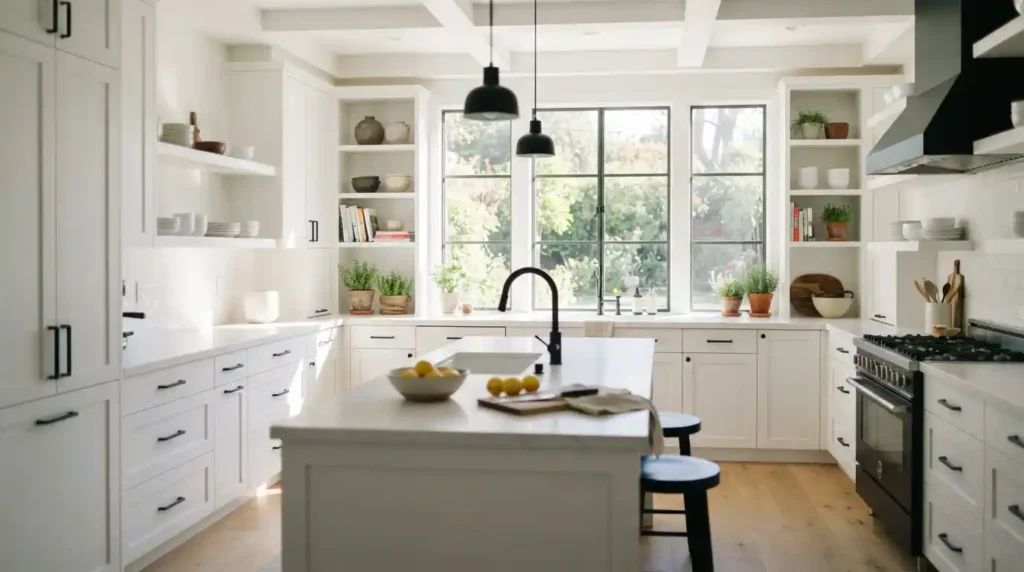
Walk into a Benjamin Moore store and ask for Decorator’s White, and you might get two different numbers depending on who helps you OC-149 or CC-20. Not a mistake. That’s the first thing worth sorting out before anything else about this color. Below: why both codes exist, what the undertone actually looks like once it’s on a wall instead of a chip, and how it stacks up against the other popular Benjamin Moore whites people usually cross-shop it against.
Two Codes, Same Paint Here’s Why
This genuinely trips people up at the counter. Decorator’s White carries both an OC-149 designation and a CC-20 designation, and they point to the exact same color, not two similar shades sold under confusing names. The difference comes down to which of Benjamin Moore’s naming systems the paint gets pulled from the classic numbering system versus the newer one tied to their Color Concierge and coordinated color collections.
Is OC-149 the same as CC-20? Yes. Identical formula, identical finished color, regardless of which code ends up on your can or your fan deck. Store associate quotes you one number, you’ve seen the other referenced online no need to worry you’re getting something different. Pure labeling overlap between two systems Benjamin Moore runs side by side.
The Undertone That Doesn’t Show Up on the Chip
This is the part that causes most of the buyer’s remorse with this specific color. Decorator’s White reads as a near-white with a distinct cool, gray-based undertone, leaning slightly blue-violet rather than sitting as a true neutral. Its Light Reflectance Value lands somewhere in the low-to-mid 80s reflecting a lot of light without going fully bright-white and the actual measured color values (hex #EBEDEA, RGB 235-237-234) confirm just how close to gray this “white” really sits.
Does it look blue or gray in low light? Often, yes. This is one of the least forgiving whites in Benjamin Moore’s whole lineup when natural light is limited. Without real warm daylight hitting the wall, Decorator’s White can read distinctly cool or blue-gray pretty much the opposite of what “decorator white” sounds like it should be. It needs good natural light to look the way it does on a sunlit chip. In a north-facing room, or under warm artificial light alone, expect noticeably cooler and grayer than the name suggests.
Where It Earns Its Keep, and Where It Doesn’t
Designers reach for Decorator’s White constantly for trim, doors, and ceilings, and it shows up a lot in modern and contemporary kitchens where a crisp, slightly cool white supports a sleek look rather than something softer and cottage-style. It also doesn’t yellow over time a real, practical win for trim specifically, since yellowing is one of the most common complaints with high-light-area whites after a few years.
One firm limit worth knowing going in: skip it outdoors. Benjamin Moore doesn’t recommend Decorator’s White for exterior use. Looking for a matching exterior trim or siding shade to go with an interior scheme built around this color? You’ll need a separate product entirely the interior formula doesn’t extend outside.
How It Actually Compares to Benjamin Moore’s Other Popular Whites
Cross-shopping clarifies what makes Decorator’s White distinct rather than just one more entry in a crowded lineup. Chantilly Lace (OC-65), one of the brand’s most popular designer whites, reads brighter and more neutral overall, without leaning as cool as Decorator’s White does once the light gets thin. White Dove (OC-17) sits at the opposite end entirely warm, creamy, pairs naturally with traditional or farmhouse interiors. Essentially the inverse of Decorator’s White’s cool-gray lean.
Simply White (OC-117) lands closer to a true, balanced neutral than either. Super White (OC-152) is the brand’s truest bright white, with far less undertone complexity than Decorator’s White carries. Sample reading too cool for your space? Simply White or Chantilly Lace are the more forgiving swaps worth testing side by side before you commit to a full gallon.
Coordinating Colors Worth Pairing It With
Benjamin Moore’s own coordinating picks for Decorator’s White lean into the cool undertone instead of fighting it. Gray Owl (OC-52) and Stonington Gray (HC-170) both work as accent or trim partners sharing the same cool-gray family cohesive palette instead of a clash. Want a bolder contrast? Charcoal Slate (HC-178) pairs well as a deeper accent. Boreal Forest (AF-480) brings a cool-toned green option in if you want to introduce color without breaking from that same cool-undertone family.
What to Actually Check Before You Buy
Decorator’s White comes through Benjamin Moore’s Ben Interior Acrylic Paint & Primer line in a matte finish, zero-VOC, low odor worth confirming at purchase if indoor air quality during painting matters to your household. Plan on two coats for full, even coverage in most applications. Budget accordingly: a standard gallon runs around $60 at most Benjamin Moore retailers, though that shifts by location and whatever promotion happens to be running.
Before buying a full gallon, grab a sample and test it directly on your actual wall, in your actual lighting, at different times of day. Given how much this color’s appearance shifts with light quality specifically, a paint chip alone genuinely won’t tell you enough to predict how it reads once it’s dry and lit by your room’s real light sources.
Conclusion
Decorator White Benjamin Moore is a genuinely useful cool-toned white for trim, ceilings, and modern kitchens but that blue-gray undertone rewards rooms with strong natural light and can disappoint in dimmer ones. Know going in that OC-149 and CC-20 are the same color, test a sample in your actual lighting before committing, and keep Simply White or Chantilly Lace in mind as backups if a test patch comes back cooler than you wanted.
FAQs
Is Decorator’s White a true white or an off-white?
Closer to an off-white. The cool, gray-based undertone and LRV in the low-to-mid 80s keep it from reading as a pure, neutral white the way something like Super White does.
Can I use Decorator’s White on exterior trim?
No Benjamin Moore doesn’t recommend it for exterior use, so you’ll need a separate exterior-rated product for a matching outdoor look.
What’s the best natural light for Decorator’s White to look its intended color?
Strong, warm daylight shows it at its best. Rooms with limited or mostly north-facing light will read noticeably cooler and grayer than it appears on a sunlit chip.
What’s a warmer alternative if Decorator’s White feels too cool for my space?
White Dove (OC-17) brings genuine warmth and creaminess. Simply White (OC-117) lands closer to a balanced, true neutral if you want less cool undertone without swinging fully warm.